Effective Branding (Or: Lessons from a cow’s bum)
July 29, 2009
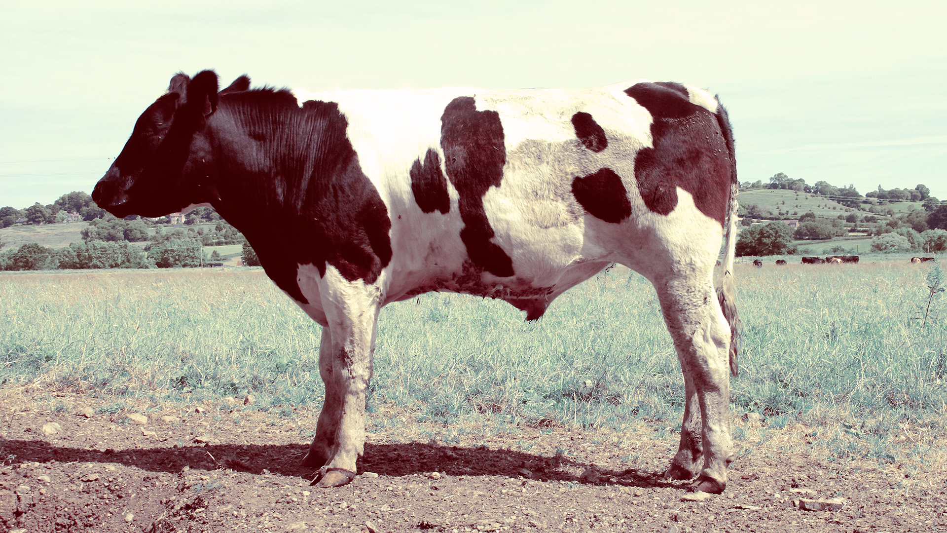
Sitting around an IKEA table and sipping lattes with a group of marketing executives and chatting about ‘incentivising this’ or ‘surfacing that’, it becomes quite a mental task to reconcile the fact that this whole concept of ‘branding’ takes its name from using hot metal to scar a cow’s bum.
But many of the mistakes that companies make in attempting to establish and extend their visual identity could so easily be avoided if these organisations dropped all the meaningless buzzwords and got back to the historic roots of true branding. And so, to the cow’s bum, we must return.
A short history of branding
Man having an innate desire to make his mark has been around for as long as there were snowy walks back from the pub, but the practice of utilising hot metal to burn a distinct scar into the hide of livestock has been traced back as far as the ancient Egyptians.
The concept is quite simple. Cows are not the most loyal bunch at the best of times and are easily swayed by a slightly greener looking patch of grass in the next field. When two farmers both have a large herd of identical looking brown cows it’s easy to lose track of a few fringe stragglers who have spotted a daisy or two that might add a certain ‘je ne sais quoi’ to the aroma of the cud.
Even if you put up fences, cows only respect physical barriers and so see no ethical dilemma in wandering through a broken section of fence into a neighbour’s field. And there is, of course, the prospect that neighbouring farmers may not be entirely honest and so may decide it makes more economical sense to ignorantly eat your strays that just happened to ‘accidentally blunder in’ among their herd (with the help of a stick) and save their own stock.
And so the brand was invented. Paint can be washed off and a coloured collar can be removed. But a permanent scar burnt into the animal’s rump was an irreversible mark of ownership that could not be disputed.
But the mark had to be robust and distinctive. If you were a farmer by the name of Fred and your neighbouring herdsman was called Paul then there was little point in you branding your entire herd with ‘F’ if all his cattle sported ‘P’ on their rears.
If a brand didn’t press into the skin properly then part of the mark could easily be lost. There were also the natural markings on the animals hide to consider and the fact that this mark would grow with the animal’s skin as it grew and therefore be stretched and distorted with time. So Ps and Fs, Cs and Gs, Os and Qs could all lead to confusion and disputes.
But if farmer Paul has marked his herd with ‘X’ then farmer Fred can brand all his livestock with ‘O’, safe in the knowledge that the markings will be distinct even with the odd misprint and distortion over time.
Even when viewed from a moving horseback in the early dawn light, with the dust kicking up around their hooves, cows with Xs can quickly be separated from those with Os.
Worst case scenario
Many company logos may look like beautiful works of art when viewed full screen on that 21-inch Mac monitor in the perfectly lit design agency’s studio, but how would your company logo look scarred into a cow’s bum?
Okay, so maybe at this moment you are falling back on the assurance that you have never had any desire to see your logo on a cow’s bum and, even if you did, you’re pretty sure that marketing wouldn’t secure the budget for it anyway.
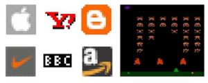
But what about when the web team want to create an icon for the website, those little favourites icons that appear in the top bar of the browser? 16 x 16 pixels is a tiny canvas to work on. Is there any part of your logo that you can isolate and use at that scale and still retain brand recognition?
And how about when your business really takes off and you decide to project your logo onto the side of an office block? How’s it looking now?
All the swirly fiddly bits and the sparkly 3D shiny parts and that lovely drop shadow might look just exquisite on your PowerPoint slides, but how’s it looking once someone prints it off in… horror of horrors… black and white!? And then they fax it over to their head office where the girl on reception photocopies it to 3 generations, as she keeps losing her originals.
Your company brand, the beloved child of so many focus groups, is now a black splodge that looks like the document has been dropped in something nasty on the pavement.
Although it is advisable to have a separate monochromatic version of the logo specifically intended for black and white usage, this logo should still be almost identical to its full colour counterpart.
The moment you create a secondary logo that is significantly different to the main logo is the moment your brand recognition goes out the window.
Life on the bleeding edge
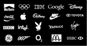
One of the greatest tests of a robust and diverse company brand is the ‘white on black’ test.
There are many occasions whereby a corporate logo may end up being printed black on white. It may be overlaid on top of a photo in a brochure or a dark background on a partner website. It may also appear in a newspaper on a reversed-out advert in order to stand out.
In large print runs the ink can often bleed slightly. Where a logo is printed on a white background, this means that the logo may expand and lose a small amount of definition. On a reversed-out logo however, the effect can be far worse. As a white on black logo is achieved by printing the background, and leaving white space for the logo, any minor shift or ink bleed will result in the background expanding into the logo. Any small intricate details on the edge or thin white lines can easily be lost altogether.
A good test for any prospective logo therefore is to view it reversed out in white on a black backdrop and reduced in size.
The most recognised brands on the globe all have logos that are bold and robust to ensure the integrity of the brand identity is retained in even the most challenging environments. Placing a logo alongside the world’s strongest brands is also a good test of how a concept stands up when viewed alongside other logos in a design.
All logos I produce are tested in this way to ensure that the concept will work successfully to promote the clients brand, regardless of the medium. It’s also a lot safer than standing at the wrong end of a cow with a hot branding iron.